
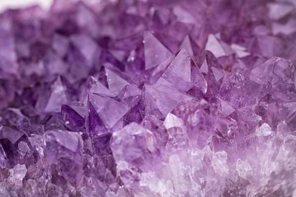
A stunning amethyst geode sits in DKP’s boardroom. In the sunlight you can see the rich depth of plums and lavenders and all the gleaming facets. You’ve probably seen a geode before, right? They are most known for their thick outer ring of dull-colored rock and crystal interiors that can only be seen when the stone is cracked open.
We admit it, at DKP we are a little obsessed with these unique rock structures. We even had a geode-cracking party at one of our team meetings. And some of us may or may not go touch the DKP geode when we’re needing a little luck.
Our admiration of geodes goes beyond just beauty — we actually went as far as to incorporate geodes into the development of the DKP logo. If you look closely at our logo, you can see not only the amethyst hues, but the facets in the design.
Much like a geode you might find in a creek bed or hillside, there’s much more to our logo than what you see at first glance. So we thought it might be fun to share a little more about the meaning behind this unique graphic representation of our company (and give you a few fun science lessons along the way).
- The Geode
These beautiful rocks might look delicate when you see the internal crystals, but they are tougher than they look. Geodes have a durable exterior wall that holds up against the elements even when surrounding rock gets worn away. Working in the healthcare industry means immersing yourself in an often chaotic and sometimes downright brutal landscape. At DKP, we pride ourselves on staying steady amidst the turbulence and shielding our clients from some of the difficulties that come with the territory.When it comes to a geode’s faceted, multicolored interior, this makes us think of our clients and their varied needs. They come in all shapes and sizes, with different goals and needs. As a result, we tailor our approach and serve up customized solutions to give clients exactly what they need when they need it.Lastly, just like the stunning crystals, we love the sparkle and shine our clients bring to our days, too. We are proud to have amazing relationships with the clients we serve; many sticking with us for years. The work that we do together to get patients access to life-changing treatments means the world to us!
- The Color Purple
Remember learning the colors of the rainbow when you were a kid? What you might not have learned is this: purple (violet) is the most powerful color of the rainbow and carries the most energy of the visible color spectrum. There’s a fun fact for your day! We love the color purple, not just because it exudes power, dignity, and strength, but this color also symbolizes prosperity, which is something we want for our company, of course, but also for each of our clients and the patients who need access. - The Compass
You might also notice that our logo has a compass feel to it with a prominent white arrow pointing up. No matter what happens in the healthcare landscape, DKP stays steady and on course. And we lead our clients through whatever ground needs covered, always navigating them onwards and upwards. As longtime leaders in market access, we are able to stay focused and grounded, keeping our clients on the right path, no matter what. - Balance
Finally, our logo was designed to convey balance. You’ll see the geometric shapes are complemented by a rounded typeface (the letters) and a fun teal color. This was important to us because we aren’t hard-edged people — we care deeply about the work we do and the people we do it with. We are a passionate, people-first team, and wanted to make sure that warmth and balance came across in the design.
We know that at the end of the day, a logo is just a logo. But we wanted to make sure ours told the story of who DKP is and what we care about. And just like the development of our branding, we put the same thoughtfulness and attention into everything we do. We dive deep and find joy in unearthing insights that move the needle for our clients (yes, we are self-admitted data and analytics nerds). And the next time you come across a geode, we hope you’ll think of us!